Our logo for our title sequence for Hunted is intended to be dark, mysterious but bold to stand out. It is intended to be jagged and borderline horror, but with thriller elements included.
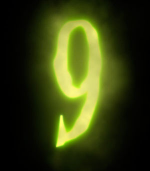 An example of what we are looking for is the '9' logo which is also a thriller movie. The logo for '9' is bold and jagged and is also slightly horror looking but looks like a thriller logo as it doesn't suggest any upcoming gore. The glow and colour of the logo contrasting the dark background makes it stand out and look bold, as we are planning to do with our logo.
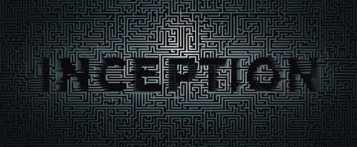
Another example is Inception. The logo for Inception has a light background with black writing, making the text stand out. The background being lighter makes the attention drawn to the detail put into it, with it looking like a maze, it suggests the storyline of the film could be similar to a maze.
No comments:
Post a Comment